
In a previous column I discussed some of the techniques and materials of tent painting. This month, we'll take a look at a few of the examples of painted tents in my print collection, to help you get a feel for what designs would look appropriate to your tent.
Before we start, though, we have to insert a few caveats. The first one, of course, is that just because we see a design in a period picture, painted with real paint on real parchment or canvas or whatever, doesn't mean that the artist is painting things exactly as he or she saw them. Much artistic license can be assumed, simply because it's easier to paint a little bitty tent on a page than to paint the real thing, and also because that artist might paint a device on a tent to indicate whose tent it is and thus clarify the story he or she is trying to tell in the painting, whether or not the tent in question (if there actually even was one) had that device painted on it. Since so few tents have survived, we're forced to rely on the pictorial record more than we probably should.
In a few cases, we're also making the assumption that what the artist is portraying is really painting, and not applique or needlework. It's reasonable to assume so, but it's nothing I'd be prepared to bet much money on. For our purposes, it may not really make much difference, since many of us are trying to achieve the effect of what we see in the paintings in the easiest way we can, and that means paint.
The following pictures are not meant to be comprehensive, but to point out specific features of certain paint schemes. Those who wish to pursue the matter are urged to visit Steve Wylie's web site and that of the Bibliotheque Nationale, where many more period illustrations are posted. I've also selected pictures that, however the original design was accomplished, led themselves best to painting.
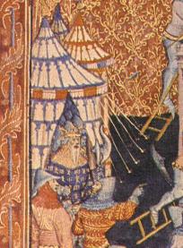 the designs on many painted tents are designed to echo features of architecture. in our first example, from a fourteenth century bodlean manuscript, we see representations of stacked colonnades, familiar from many towers and campaniles (of these, the famous "leaning tower" of pisa springs immediately to mind). note that the tiers become smaller, with the "columns" more numerous, as your eye travels upward from the base of the tent to the valance. This feature give the illusion of greater size and solidity. Above the valance, the colonnades continue up the canopy, with the tiers still becoming shorter, but with fewer columns portrayed, to give the uppermost area a feeling of lightness. This effect works best on a tent with vertical sides, like most of the Panthermastersmith rounds.
Another motif, shown below, is the "Gothic tracery" motif, usually displaying high, pointed arches with some sort of embellishments at the point where the vertical columns flare out to form the arches. (This particular example, also fourteenth century, is from the Bibliotheque Nationale in Paris.) Several variations of this scheme are illustrated here. They lend themselves equally well to straight-sided or slope-sided tents. In all cases, there is a conscious attempt to evoke architectural themes ... one of the larger tents even has "towers" at the corners! Also note that a maximum effect has been wrung from a minimum of paint, and that most of the tent is left unpainted to allow light to penetrate to the inside of the tent.
I've heard it said that the original reasons for painting the vertical lines of a canopy was to waterproof the seams, but after looking at the patterns on the roofs pictured here, it seems hard to believe that anybody would have laid out the seams that way. Even where the line is predominantly vertical, it seldom continues all the way to the valance. It seems safe to say that the purpose was strictly ornamental.
in the picture of the rectangular tent at left, also from the bibliotheque nationale, the painting is confined to the roof alone. note how the use of the line tends to draw the eye upward, with just enough embellishment on the bottom to keep it from looking boring, and the vertical lines supporting a much "busier" (but still airy and fragile-looking) upper design. the round tent behind it has what appear to be "rayonny" lines converging at the apex of the tent. these lines serve the same purpose of drawing the eye skyward and emphasizing the height of the tent. similar treatments abound in the pictorial record, and contribute mightily to the impression of "medievalness" in a tent, so they would be worthwhile ones to emulate in your own design.
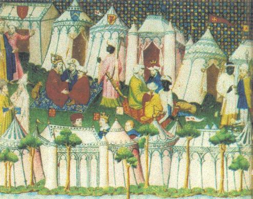
 of course, if you're the flamboyant type, there's no law that says you have to stick with architectural images. in the picture to the right, the painter has forsaken the gothic tracery altogether. instead, we see the devices of england and france repeated with other ornamental folderol. (the picture shows the french king charles vii giving his adieus to his daughter isabella before the english envoy takes her to english king richard ii; therefore, this is probably another one of those illustrations where the devices on the tents help illustrate what was going on.) if you go this route, consider using a charge from your own device in a similar manner. this approach lends itself well to stenciling or silk-screening (although it might be easier to paint the panels before seaming them together because, if you mess up, you need only replace the panel rather than the entire tent. don't be shy about using the pattern over and over again, as much as space allows. one of the themes in tent embellishment seems to be: "nothing exceeds like excess."